37 SaaS Website Examples For 2024
SaaS websites are designed to attract and increase conversion rates for your business. They are carefully balanced to present functionality and show aesthetic appeal. Your SaaS website design should effortlessly accomplish all this to ensure that users who visit your website will want to stay on that website and gain the services you provide.
However, it is important to know that creating a SaaS website for your brand will be tricky, no matter how easy you think it seems. Here, we have gathered the best SaaS website designs that will spark ideas for your next project. The purpose of a well-made SaaS website design is to convert. You will discover, in this comprehensive example guide, how the use of color, animations, whitespace, and interactivity affect the level of conversions. Let us get right into the list.
What Are SaaS Website Designs?
SaaS website designs are mainly designed to showcase software as a service and the services they provide (of course). A SaaS website design emphasizes the product value and needs of its consumers and audience, along with the website features, clear call-to-actions (CTAs), client reviews, and interactive elements to further attract viewers to stay on the website for longer.
A SaaS website design should represent a modern and clear style while also being responsive. This makes your SaaS website easier to access across all devices anywhere on the go, and responsive websites ensure a user-friendly experience.
Top 37 SaaS Website Design Examples for Your Next Project
In this section, we have compiled the best SaaS website design examples that use the best strategies and provide the best user experience. Let’s begin the list.
1. Lattice

Lattice is a good example of their amazing homepage. It immediately introduces viewers to a variety of their services and prominent CTAs. All the services are showcased right in front of them. Additionally, the use of bright colors, and whitespace is attention-grabbing.
2. DropBox Sign
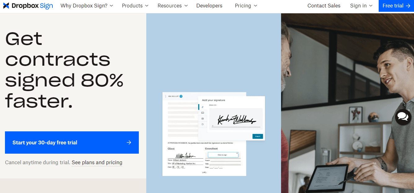
Split screens are also a great way to capture a user’s attention. The above SaaS website design is of DropBox Sign. There are three sections on the homepage, and the thirst layout style is noticeable in 2024. This kind of SaaS website design is one of the easiest ways to increase your conversions and pack more services or information to your homage so viewers see exactly what they are looking for.
3. Streak

Streak is a great example of a SaaS website design that uses whitespace to its advantage, along with the power of illustrations. The CTA is at the top right corner, in bright orange, which will immediately grab users’ attention. There are also more action sections after the large heading. Notice the typography and the use of colors. It makes the logo and CTA stand out.
5. Proof
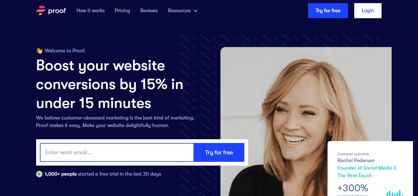
Proof used a dark blue background and white typography, making the words stand out and enhancing the call to action. They also mention their social media handles, and the addition of stats makes the words seem more legitimate.
6. Kajabi

Another SaaS website design that puts great emphasis on the words and a CTA in the top right corner. Kajabi uses a faded background with colors that makes the lime-green typography in bold standout. It is a very interesting and in-your-face approach.
7. Petal
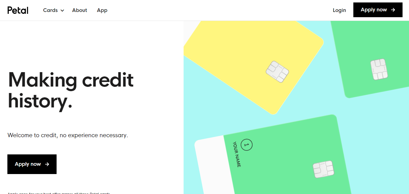
Petal is another example of a split-screen homepage SaaS website design. While most banking apps seem to have happy faces and sophisticated or polished pictures, this website design takes a different approach. It is bright, colorful, and interactive, with the cards on the right side of the screen rotating, creating an interactive effect. This SaaS website design makes banking look less intimidating.
8. Appcues
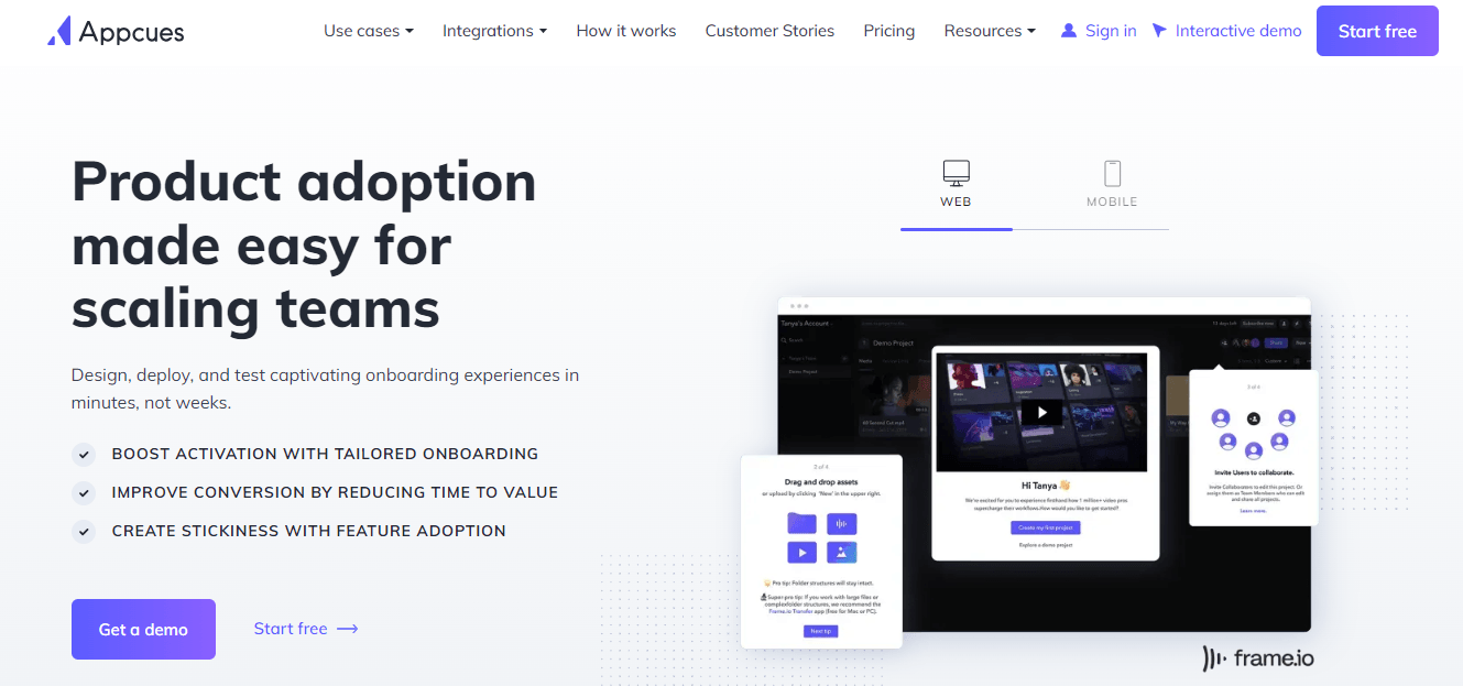
Appcues is another SaaS website design that is a great example of the benefits of using whitespace in website designs. Not every website needs to add background color; in fact, some look more polished and create a weblog effect, bringing more emphasis on other elements and interactive features on the website. The CTA here is in the bottom left corner, with a blue-purple hue, making it stand out.
9. Spotify
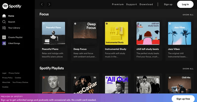
Spotify is known to be one of the best SaaS website designs in 2024 for its attention-grabbing effects and overall services that it provides to its users. When you arrive on the homepage, you get a list of all the songs and new playlists to discover. The design for this SaaS website design is truly unique.
10. Klezmer

The first prominent feature on this Klezma website is the parallax scrolling. This interactive scrolling keeps users happy, and it just does. They stay on your site for longer just to be amused by the scrolling. Next, it introduces different site elements, making it more intuitive. The colors also create a vibrant effect and make the website look more compelling.
11. Buffer
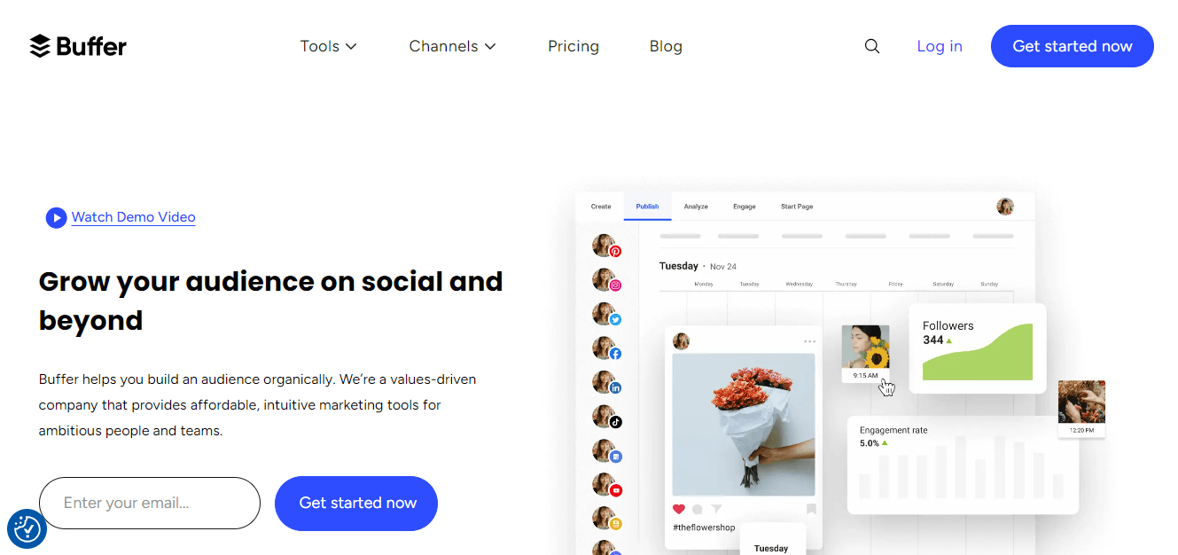
Buffer is a SaaS website design that also shows the power of using white space. This website includes imagery and creates an authentic personalized brand story. It also includes cartoon-style illustrations that walk you through the steps of using its services.
12. Gemnote

Gemnote is a SaaS website design which uses elements and interactive features that immediately grab one’s attention. By using such elements makes sure that users are bound to explore your website more because they enjoy it. There are different kinds of illustrations used in an edgy way, adding class to the website design.
13. Grow

The website design you see above is by Grow. The aim is to attract enterprise clients interested in advanced analytics. The bold words “LEAD WITH DATA” would immediately attract such clients. This is a great SaaS website design, creating a unique identity in the marketplace.
14. Loom
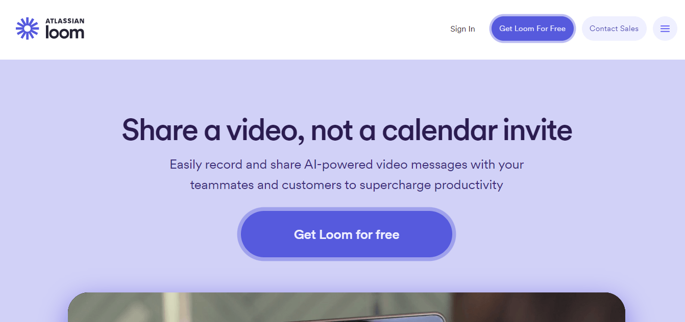
Loom has a simplistic approach to a website design. Here, you can see the different shades of purple used and bold CTA right in the middle. It is an interesting SaaS website design, and you will notice that it will trend in 2024.
15. Lokalise

The SaaS website design example we chose is by Lokalise. We chose it because of its unique way of showcasing the services it provides. It adds a dash of color here and there, and the background is pale, emphasizing the text and other bright colors. This creates a standout impression on users and earns potential clients.
16. Draftbit
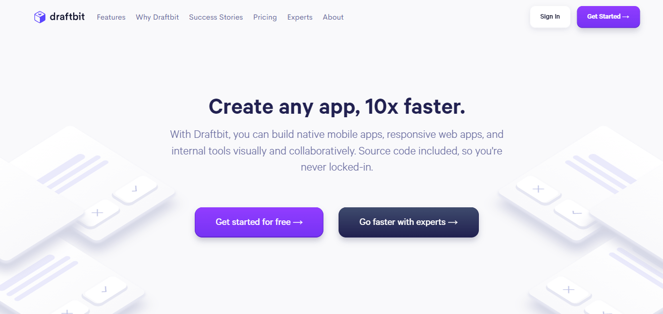
Draftbit is another SaaS website design example that uses whitespace but with a little twist. In the background, there are little graphical elements. There is also a purple CTA, and the bold test in the center will immediately catch potential customers’ attention.
17. User Interviews
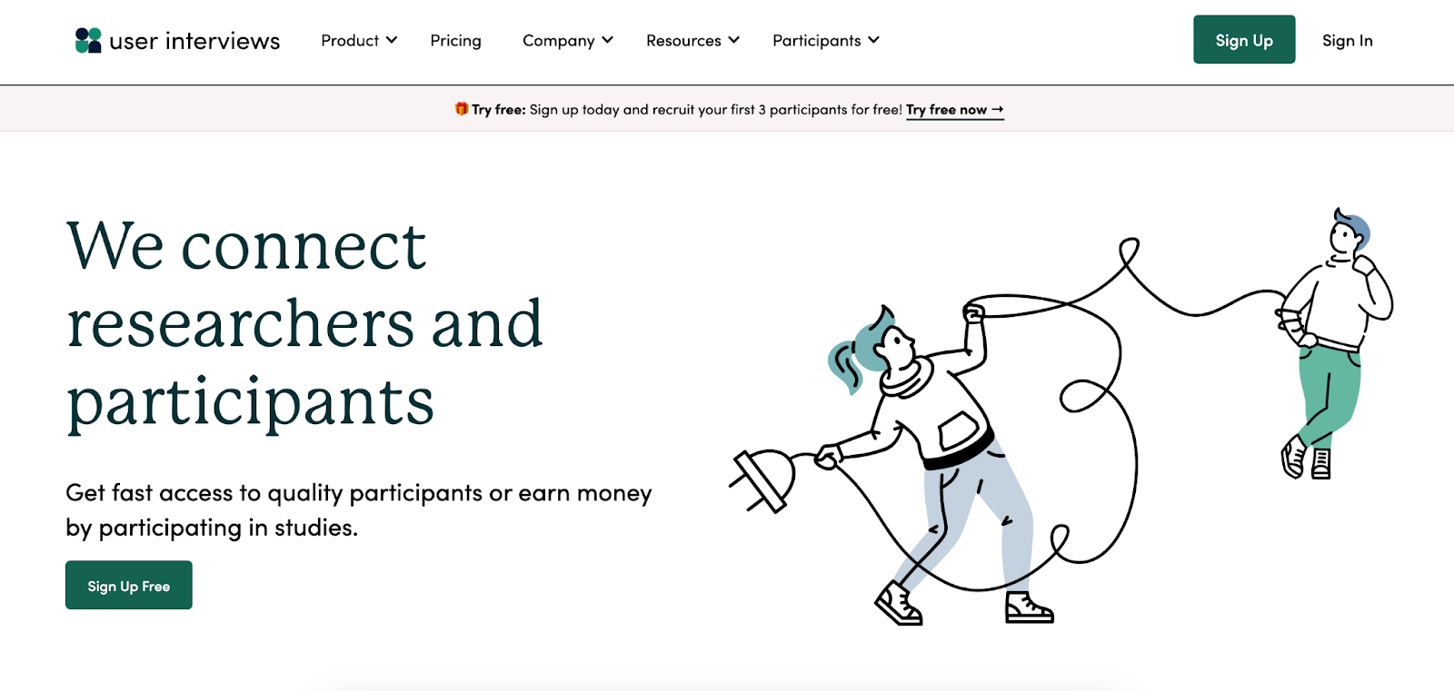
User Interviews has a user-friendly SaaS website design that is packed with fun illustrations, interactive design elements, and testimonials. Additionally, they place their CTA, “sign up for free,” boldly and clearly throughout the website.
18. Milkshake

Milkshake’s website design is straightforward but effective. As soon as you land on the homepage, you are greeted with the option to download the app. They offer two app download options, so you are immediately redirected to the downloading site without having to leave the app. The design may be plain, but it is pretty creative and bold.
19. Prisma Labs
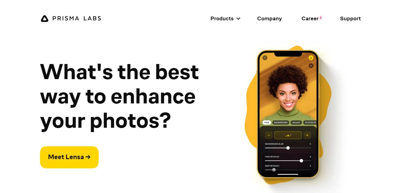
Prisma Labs uses a minimalistic homepage, which is its strength. The focus is on the moving mobile phone, which shows the before-and-after images. The primary copy in the center of the homepage asks the visitors a question, making the entire page more interesting and engaging. Here, there is little to no content because the main aim of this SaaS website design is to show its users what the business can do. When you opt for a design like this, it is important that you add interactive elements and features that will attract users and show what your services are about. If not, then viewers could get confused.
20. Obviously AI

Obviously AI uses moving graphics to keep users entertained. The CTAs and color usage against white space really make this a great SaaS website design example. This creative SaaS website uses an interesting approthathich is successful in making users stay longer on the site and discover more about the services they haveoffervide. It is important to remember that using little moving animations in your website design is a good way to keep users entertained.
21. Zentail

Zentail’s SaaS website design immediately attracts visitors by using bold statistics to grow sales. This is quickly followed by brand recognition and testimonials from clients. You can see the full stars given at the end, which builds trust towards the users. The use of white space here brings out the typography, immediately making viewers want to read through the bold text which is bold enough to catch their attention.
22. Getaround

Getaround is a SaaS website design that uses a creative approach to attracting customers. First, there is the giant search button, along with the words “unlock cars 24/7.” This instantly creates a feeling of vibrancy. Again, here you will notice the use of white space doing justice to the entire SaaS website design layout. It is not overwhelming, and the colors chosen are rather fun.
23. Zight

Zight is a visual communication tool on our list. This website design opts for a more formal look, with a white main screen and light blue and pink highlights and buttons. This color palette, which has lots of white space to its advantage, acts as a great canvas for colorful visuals that show how the app works.
24. Modyfi
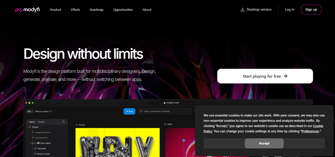
Modyfi’s SaaS website design takes interactivity and innovation to the next level. When users scroll down the home page, they navigate through the product, which includes features like collaboration tools, automation, and flexible image processing. Additionally, throughout the website, there are moving elements and videos that play on their own. This makes users want to go through the website more. When they see what they like, they gravitate to click on that.
25. Ramp

This SaaS website design, Ramp, includes the logos of some of its most prominent customers, including Glossier and Shopify, which improves its brand as reputable and trustworthy. Here, you can see the use of a dark background to bring out the typography text in white, along with the images of a tablet and smartphone to represent that it is responsive and also has an app for users to download.
26. Kisi

Kisi takes a different approach to SaaS website design. Instead of a static background, they use a moving background, which is a great way to keep users on the website and allow them to view the whole video playing in the big background. This is a unique style that attracts viewers.
27. GitBook

GitBook positions itself as an outcome every user will appreciate. It uses interactive demos and elements, screenshots, and short text blocks. This user-friendly SaaS website quickly communicates what’s in it for users. This SaaS website design may seem simple, but you will be surprised how many users find simplicity amusing. Do not be afraid to request a simple SaaS website design. It may just do you wonders.
28. Whimsical
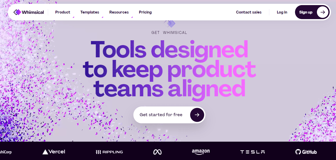
Whimsical is another beautiful SaaS website design which had to make it to the list of top 37 SaaS website designs in 2024. The confetti in the background and the use of colors are going to immediately attract, not to mention that the big text has changing colors, creating an interactive approach. Users enjoy looking at colors that are not too overdone, this SaaS website design example shows a perfect balance of this approach.
29. Storetasker

As a marketplace SaaS company, Storetasker takes a creative approach to its background. While the little picture below is blurred, its background version is also blurred. This creates a fashionable and classy effect and makes the website design fun to look at. As the pictures change, so does the background. This SaaS website design may seem elegant, however, it stands true to the services that this business provides.
30. Kraftful

Kraftful’s SaaS website design gets right to the point. The main header copy is bold and something users will immediately look at. It invites users to start a “free plan” with a featured call to action. Bright colors, illustrations, and customer testimonials offset the complexity of this startup’s product. Additionally, the little icons on the homepage move, creating an interactive effect on the website homepage.
31. Procare Solutions

Procare Solutions is a simple, cute, and creative SaaS website design that needed to be included in our list. This website design is the best example of simplicity at its finest, with clear information for users to see and a stand-out CTA. It has a perfect user flow and guides users through to learn more about the management that they offer.
32. Nauto

Nauto is another SaaS website design that uses a moving movie background. The video preview keeps users engaged, and the CTAs perfectly align. It is a mesmerizing way to keep users on your website and make them want to discover more about it. This approach is perfect when you have minimal words or content on your website homepage and want to show more.
33. BILL
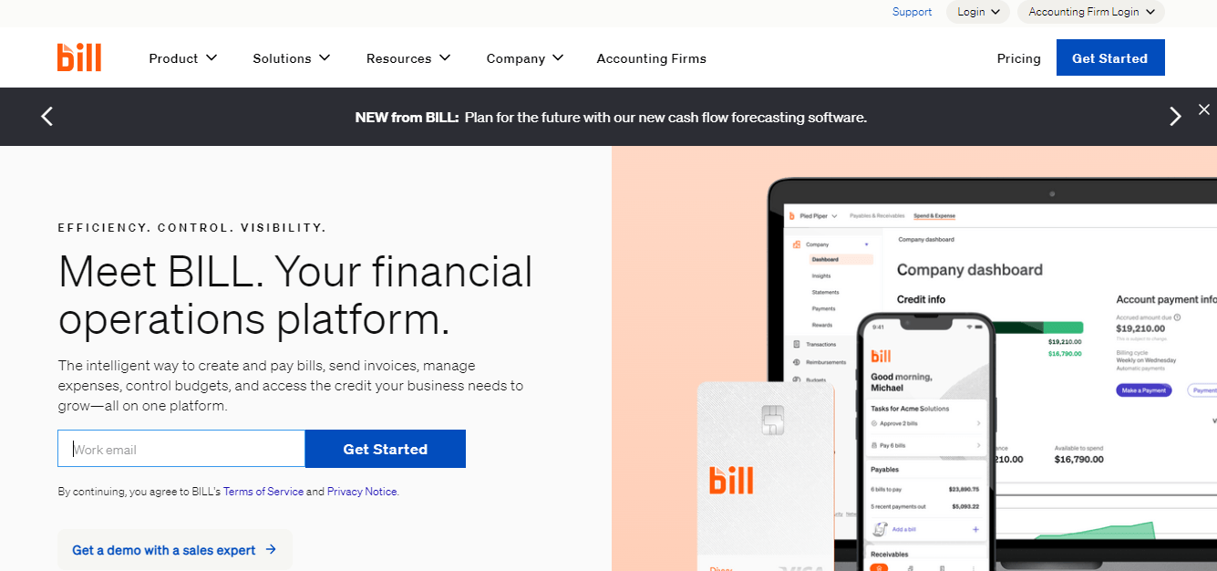
BILL has a rotating hero copy that shows several different benefits of using its products. This allows its solution to resonate with a range of potential customers. BILL has something to offer visitors who need help reducing their paper, automating their workflows, or reducing friction in their processes. They also include pictures of different devices on the right side of the website to represent that they are responsive.
34. Gumroad

Gumroad is another unique SaaS website design that creatively showcases all its services. With its dark background and retro-looking animations, it is certainly an eye-catcher. This is a trending website design style for most SaaS website designs since it has the potential to keep users on the site to discover more.
35. Jasper

Jasper is an AI-powered content creator with a great SaaS website design that attracts customers. As soon as you visit the homepage, you are greeted with color and large typography, which complement the SaaS design services. The website also successfully demonstrates its tools, how it can work, and so on. Another noticeable feature is the use of a bright background color which is not overwhelming.
36. Formstack

Large, small, or somewhere in between, businesses are always finding ways to make their methods craftier and more efficient. Formstack, a workflow automation software, promises just that in its web design. In line with its unique value proposition of making business owners’ and employees’ lives easier and simpler, its SaaS website design and functionality, which features a product hero and clear CTAs, are sleek, simple, and not too overcrowded. This means visitors feel inspired to learn more or start a free trial.
37. Thena
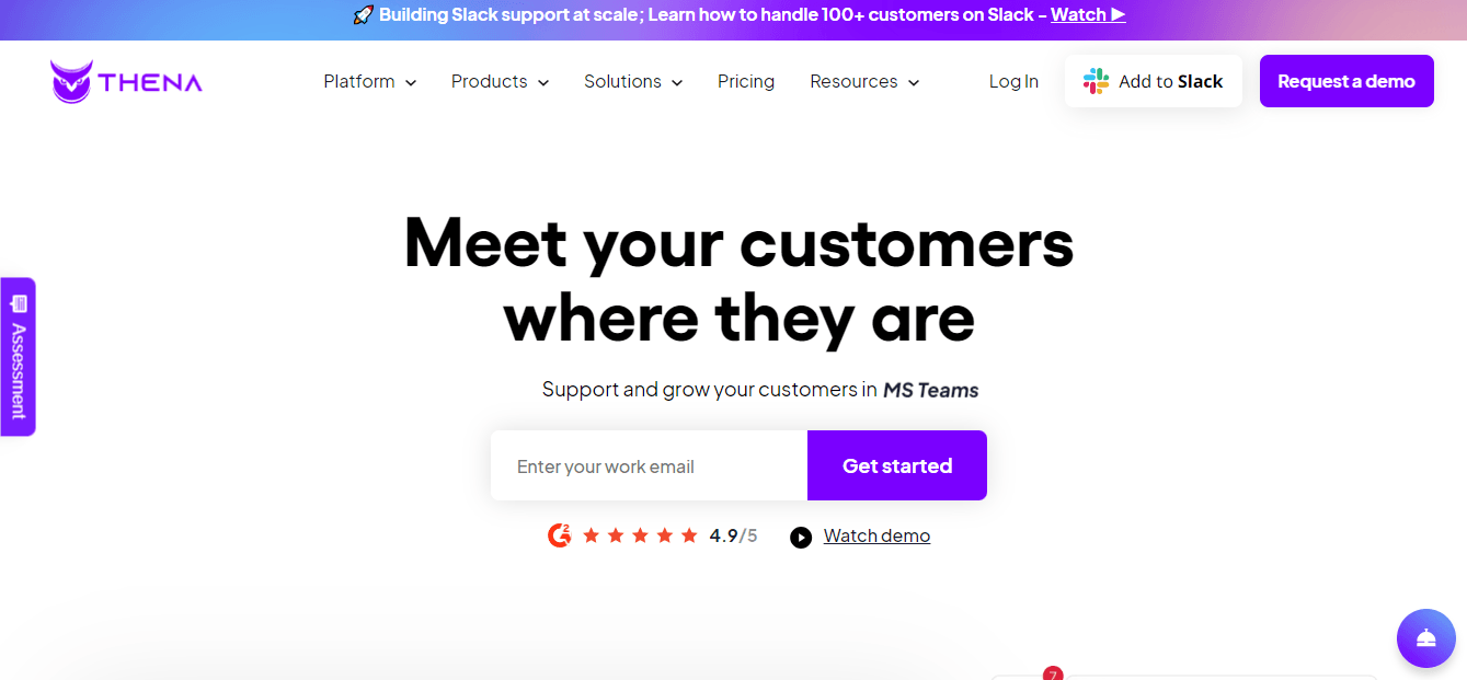
You may have noticed many SaaS website designs that use purple hues in their homage. Purple is known to be one of the calming colors used to keep viewers online. Yes, this is one secret. However, moving on to the rest of Thena’s website design, you can clearly see they used white space, and that makes the rest of the content and CTAs stand out, such as “get started,” “ request a demo,” and also the 5-star ratings.
Own a SaaS Website Design that Captivates and Converts
When it comes to designing a specific website design, in this case, a SaaS website design, using the right graphical elements, CTAs and intentional use of white space matters. We have witnessed many SaaS website design owners suffer by using the wrong approach and strategy on their websites. Some features can be too overwhelming for users, and that can drive them away instead of converting them into potential and loyal customers. While creating a SaaS website design can be tricky, it is not impossible to gain.
Websleagues is known for creating stellar SaaS website designs for businesses in every industry; regardless of whether your firm is big or small, the SaaS website design our experts create is professional at the end of the day. What is better is that we have a client-centered approach and apply a custom approach. This means that we do not use ready-made website templates that are readily available online. That lacks a personalized touch. We carefully design your SaaS website design to stay true to your business and apply the right design features and structure to further complement the overall design look. Our aim is to provide you with a functional and easy-to-navigate SaaS website design that enhances user experience. If you are looking for a way to own a website design without the hassle of having to explain what you want in it often, our SaaS website designers know what website design will resonate with your brand and attract the right customers for you.
FAQs
What does SaaS stand for?
SaaS stands for “Software as a Service.” It is known as a cloud-based strategy for providing software to users. Usually, this would include users to subscribe or install their applications.
What is a SaaS website design?
A SaaS website design refers to developing and creating websites tailored to software-as-a-service businesses. The main priorities for SaaS website designs are to provide users with easy navigation, a seamless experience on the website, clear communication and content, and an impactful message that showcases the business’s services.
How long does it take to design a SaaS website?
A completely custom SaaS website design should normally take 4-6 weeks to create; however, depending on the complexity, number of pages, graphical elements, and additional services you ask for, the delivery time could vary.
What is the difference between a SaaS and a normal website design?
The difference between a SaaS and a normal website is that SaaS website designs have more CTAs and evident services showcased to attract other business clients who are looking for their services. A normal website can also include these things, but they are optional. The primary focus is to ensure that users are satisfied with the overall experience that the website delivers.
